Examples of Radar Chart Applications in Business
The ever-evolving field of business requires efficient tools for data visualization, and one such tool is the radar chart. By presenting multiple variables in a two-dimensional graph, radar charts provide an incredible way of understanding complex data. In this article, we delve into the concept of radar chart applications in the business sector, explore their design intricacies, analyze their impact on business insights, and look at some examples of radar chart.
Unfolding the Concept of Radar Chart Applications in Business

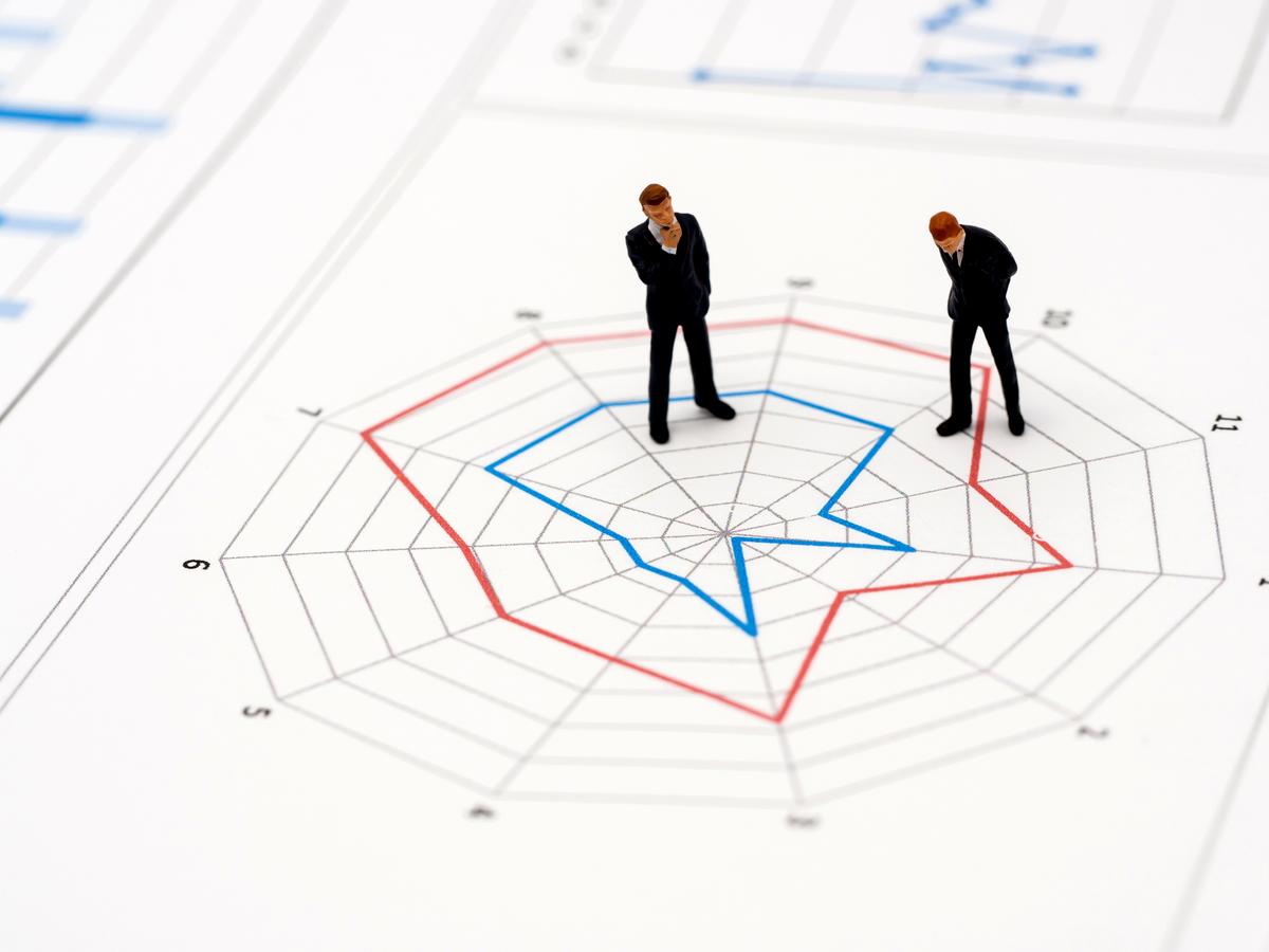
A radar chart, also known as a spider or star chart, is a two-dimensional diagram designed to plot one or more series of values over multiple variables. Radar charts come in handy when comparing performance metrics, analyzing statistical data, or looking into competitive analysis. They enable businesses and other organizations to visualize their success in multiple areas concurrently, making them indispensable in strategic planning.
Radar charts can also effectively depict the skill sets of employees in an organization, serving as an unusual yet potent tool for human resource management. Additionally, a well-crafted radar chart can perfectly exhibit a company’s performance metrics, aiding in understanding how well the company is performing against its key performance indicators (KPIs).
Delving Into the Intricacies of Radar Chart Design
Visualizing trends and representations in a multi-dimensional dataset requires a robust and comprehensive design. The primary step in developing a radar chart involves identifying the variables that will be contrasted. These variables form the axes of the chart, helping to construct the ‘spider web’ structure.
The data should be plotted on these axes with clear and precise markers. This not only enables an easy reading of the chart but also accentuates the patterns that the chart represents. Also, for each variable, a line is drawn connecting the data value for each spoke. This gives the chart its characteristic ‘radar’ or ‘spider web’ appearance.
Lastly, while designing a chart, it’s critical to utilize colors that enhance clarity rather than introduce confusion. The choice of colors should aim to distinguish data sets visually, thus making the chart easy to follow, appealing, and informative.
Increased Business Insights Through Radar Chart Analysis
Radar charts can greatly enhance business insights by presenting a global perspective on multiple variables simultaneously. Through these charts, businesses can visually interpret the interconnections and trade-offs among these variables. By probing the patterns, businesses can understand how changes in one variable may affect others, thus allowing for better decision-making.
For instance, in the universes of marketing research, radar charts can illuminate product gaps in the market, help understand customer preferences, and reveal competitive strengths and weaknesses. Understanding these aspects can aid businesses in pinpointing areas of improvement, forming the basis for effective strategy formulation.
Similarly, in human resources, these charts can provide insights into the strengths and weaknesses of employees regarding various skill sets. Such data analysis can assist HR professionals in making informed decisions about training requirements, skill development, and talent management.
All in all, analysis through radar charts increases overall clarity and aids in framing comprehensive strategies by providing valuable insights, potentially driving businesses toward success.
Examples of Radar Chart Implementation in Various Business Sectors

From technology to marketing and HR, radar charts are used in many business sectors. In the technology sector, for instance, product managers exploit radar charts to make comparisons between different software and apps based on various indicators like ease of use, scalability, or cost of implementation.
Sports industries utilize radar charts to compare the performance of players based on different sport-related variables. These charts serve as a quick reference tool, aiding coaches in making data-driven decisions on team selection.
Healthcare is another sector that utilizes radar charts, with its application in comparing patient responses to different treatment options. This is based on several variables like effectiveness, side effects, cost, and accessibility.
Key Points To Consider While Employing Radar Charts for Business Data Visualization
While employing radar charts for business data visualization, it’s essential to keep in mind a couple of key points. First, care should be taken while selecting the variables for the chart. The choice of variables determines the effectiveness of the radar chart as a visual representation of data.
Secondly, ensuring the scale for each variable is accurate and consistent across the chart is essential for reliable and meaningful interpretation of data. Misappropriate scales can result in distorted representations and ultimately lead to incorrect decision-making.
